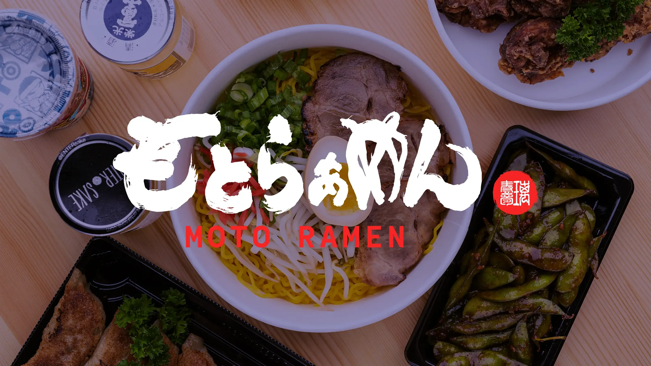
Moto Ramen
│
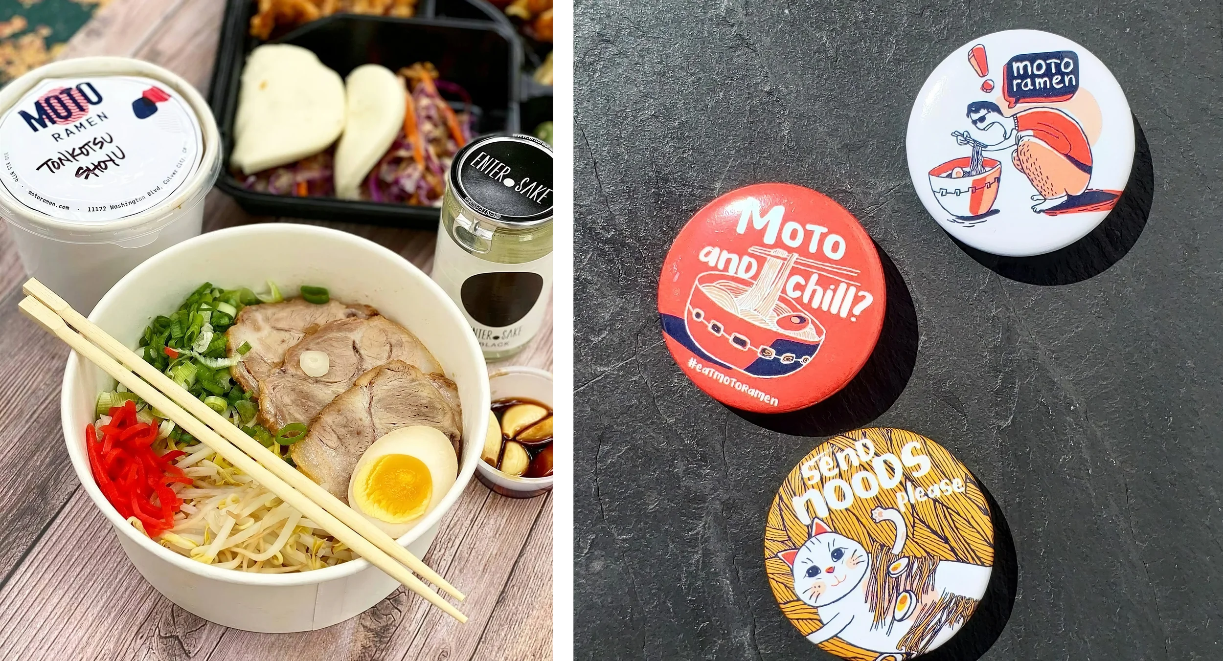
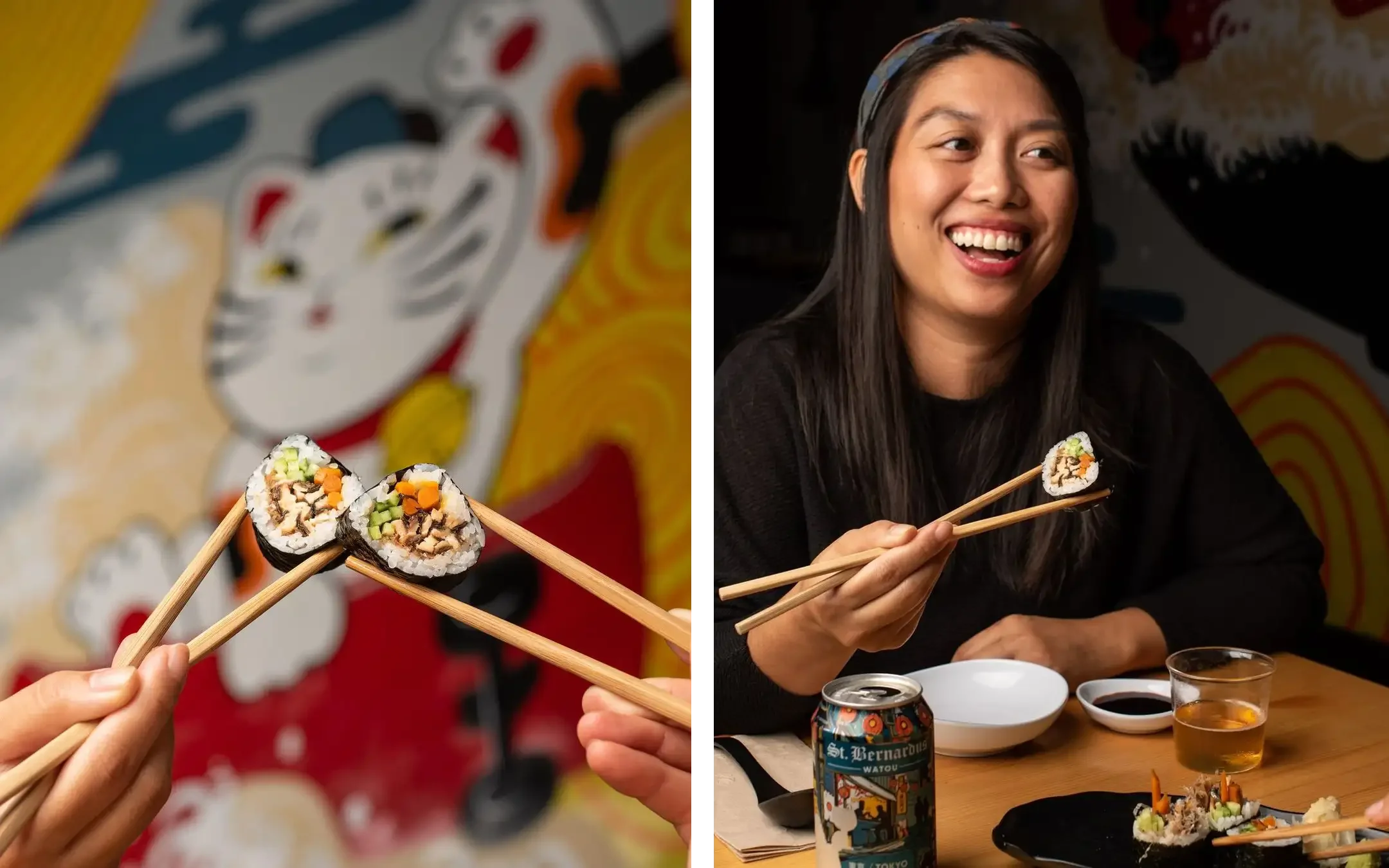
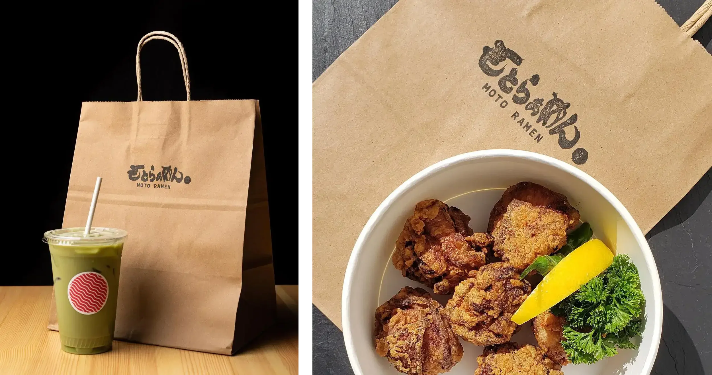
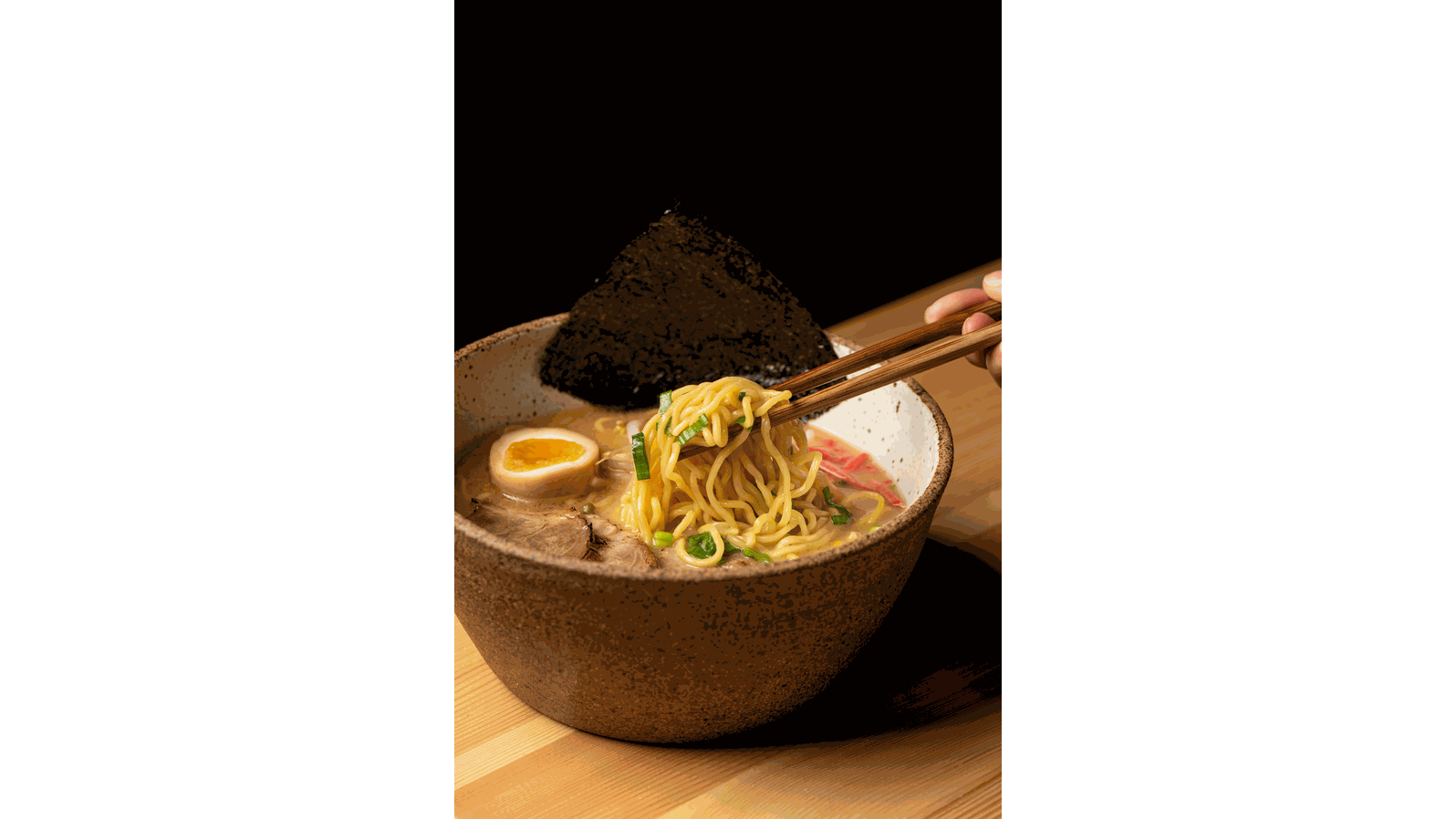
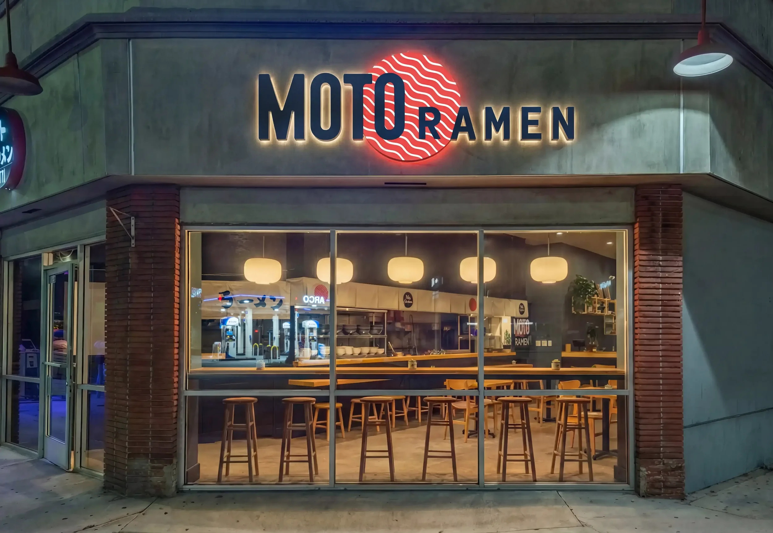
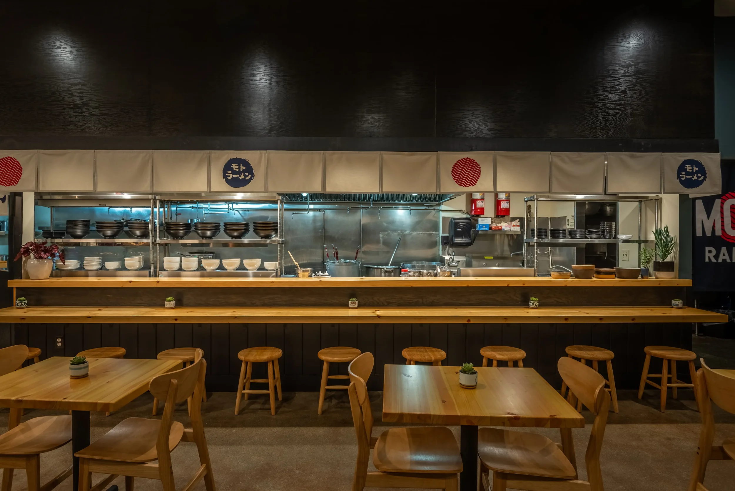
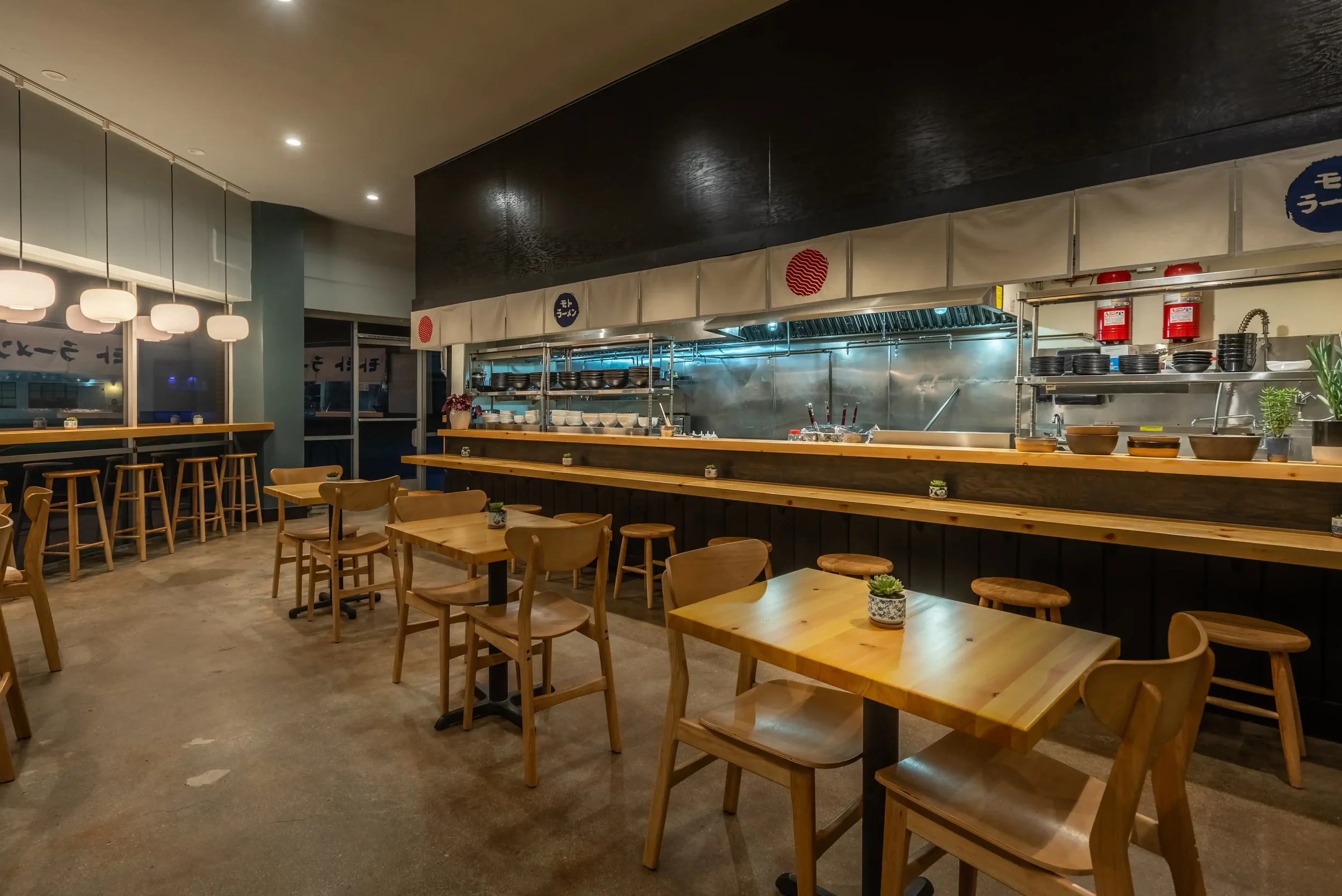
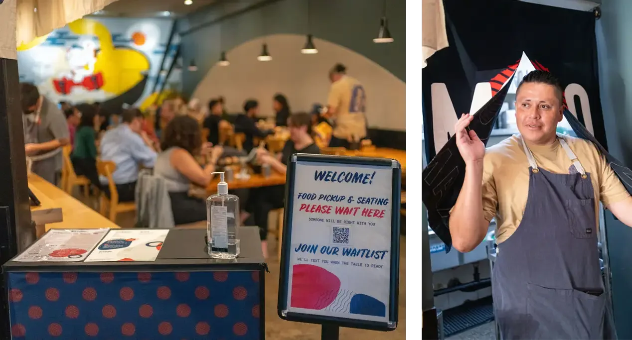
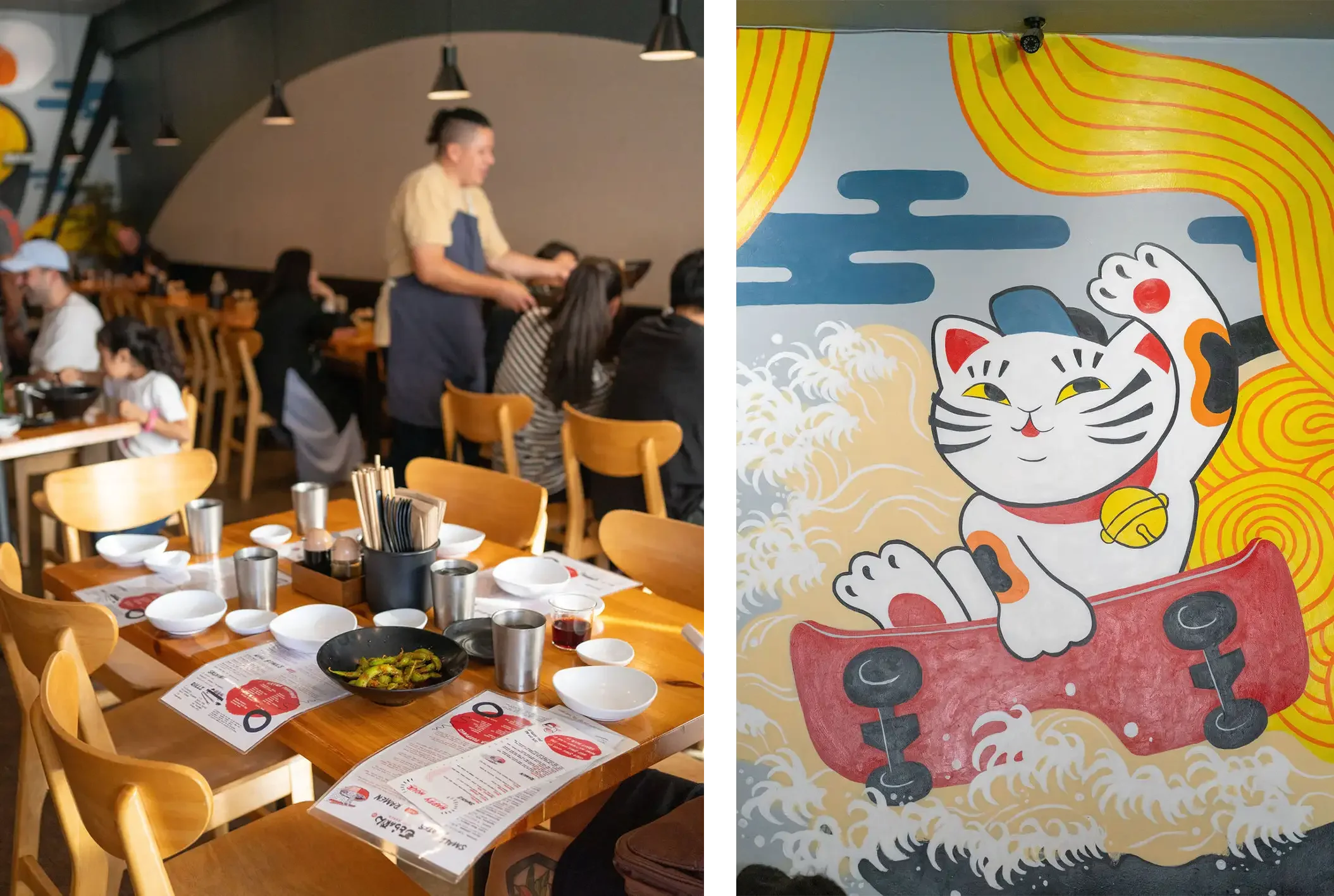
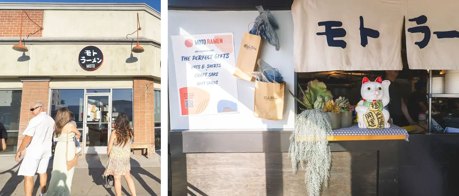
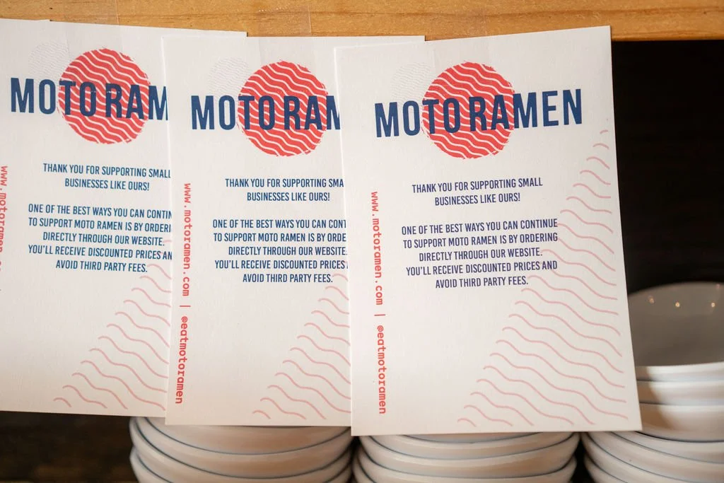
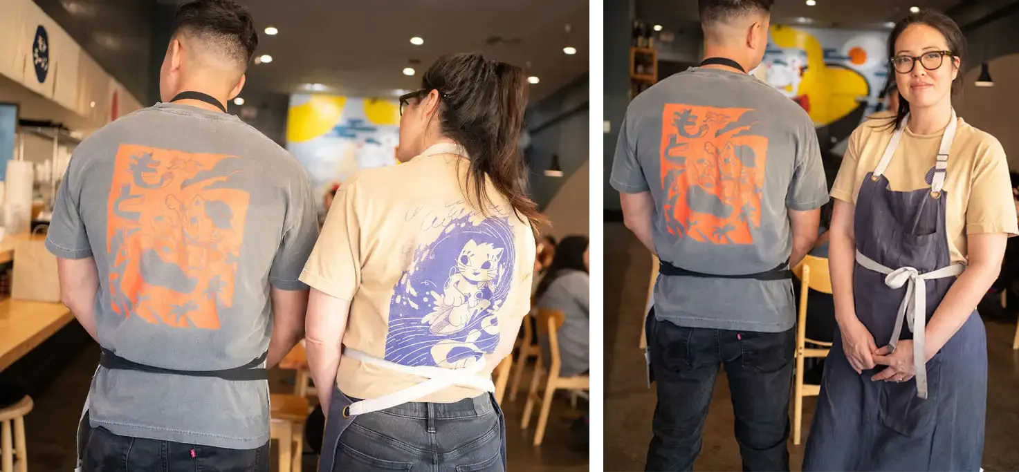
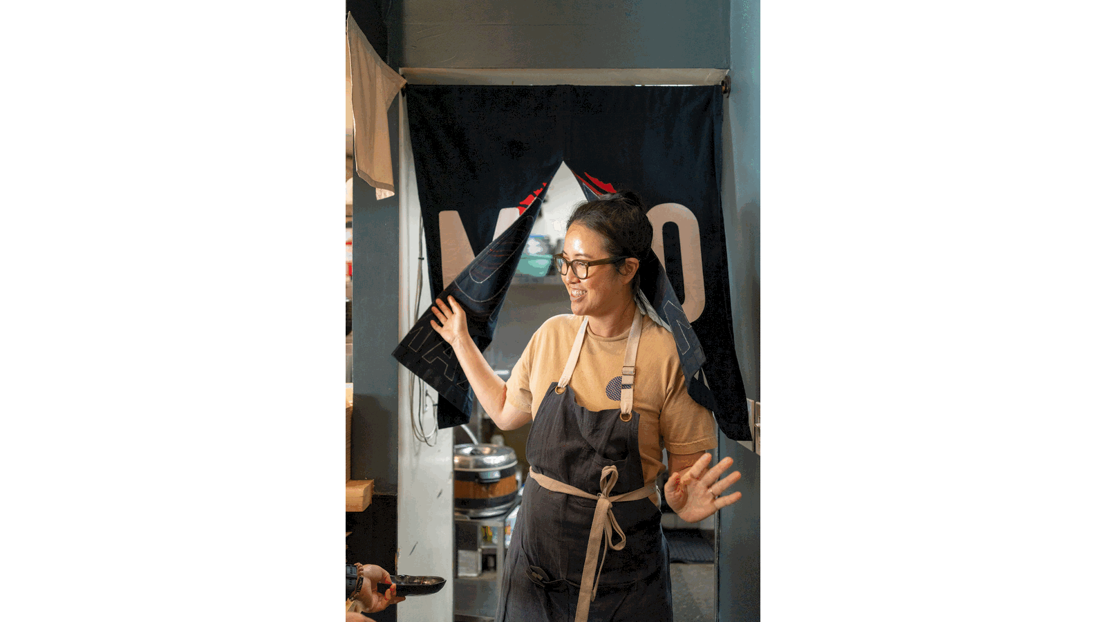
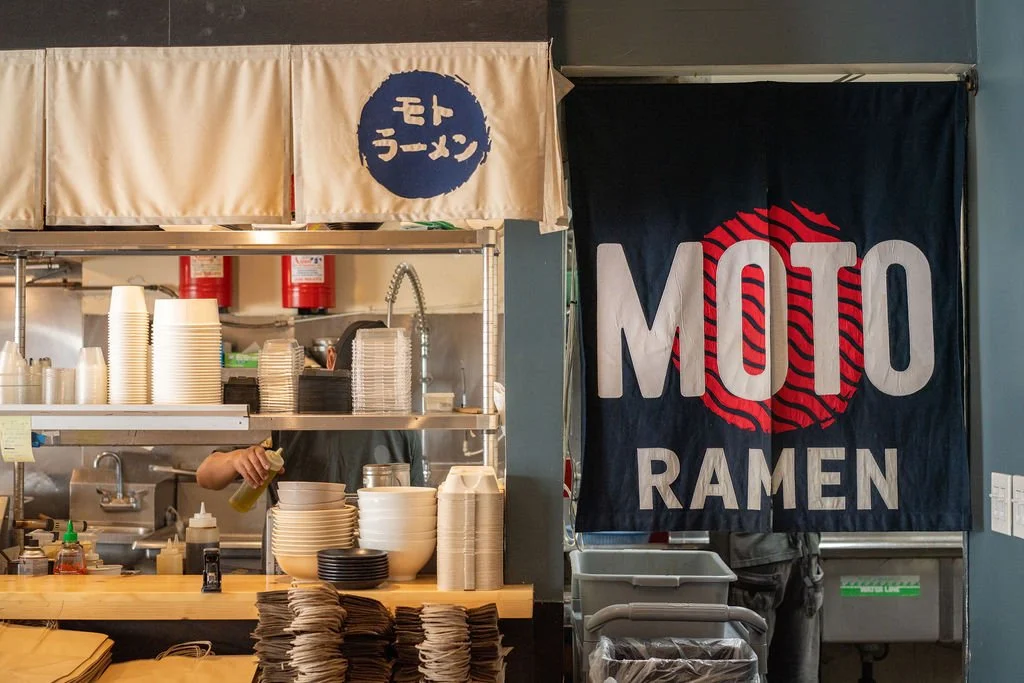
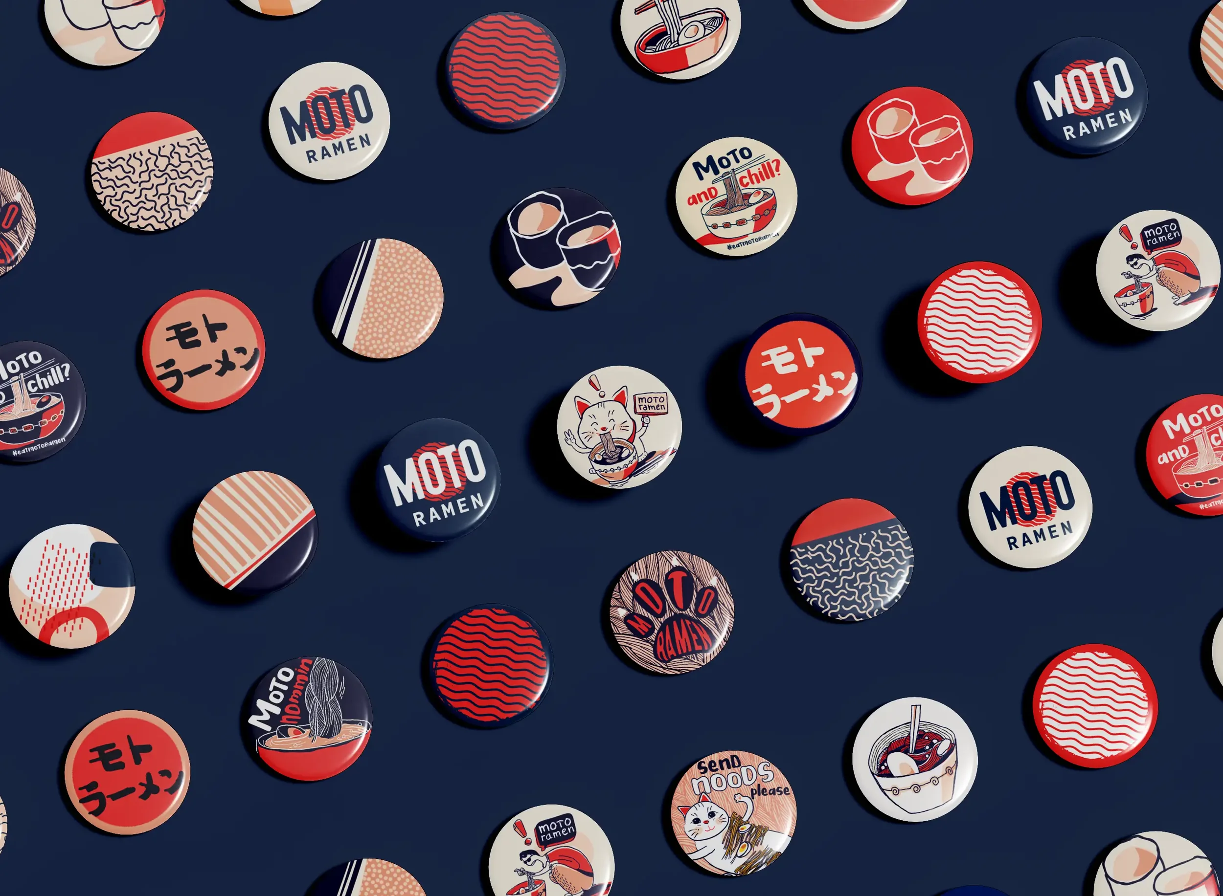
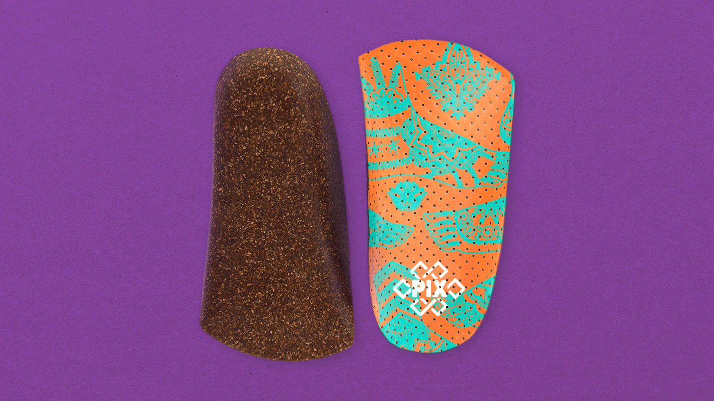
Launched during a global pandemic, there is no rational reason that a small Japanese Ramen restaurant in LA should have survived. Moto — meaning origin, roots, heritage — needed a brand identity that could carry that meaning from the first glance. For this Culver City culinary cornerstone, we built a visual identity from the ground up that honors the Okinawan traditions behind the menu while unmistakably feeling like the family business that it is. From logo and typography to the full brand system, the result is a restaurant brand with real personality: warm, bold, and rooted.
Branding, Marketing, Illustration, Art Direction, Environmental, Website
▿